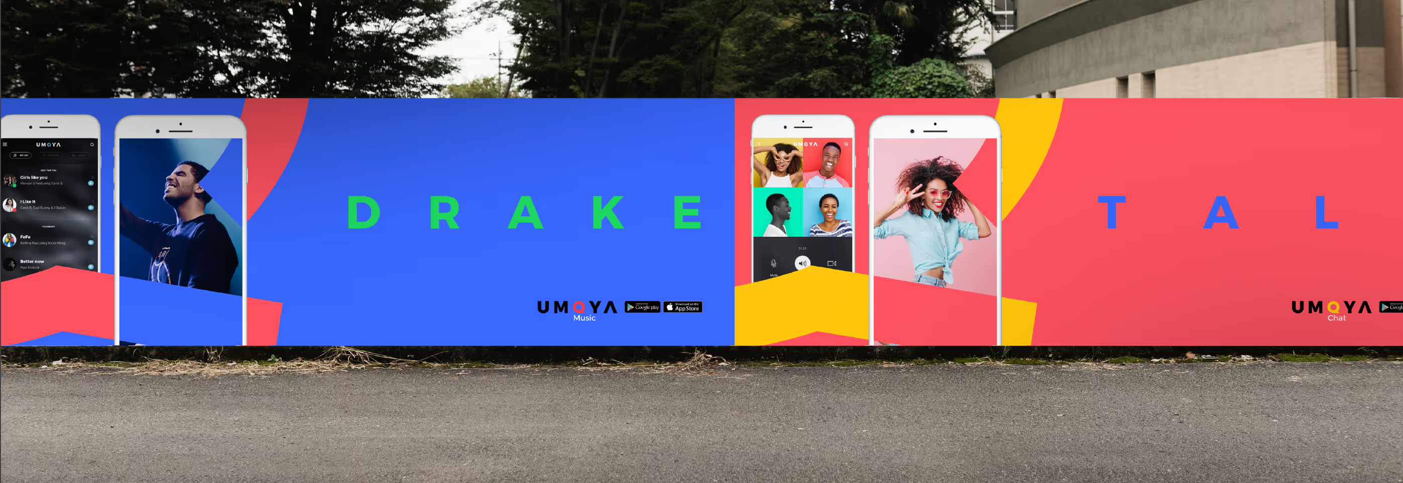


Create an exciting identity, user interface and web design for uMoya - an OTT app, offering access to chat services, music, videos, food delivery and more, across the African continent.
Borders found in Africa are arbitrary, having been drawn up only 136 years ago. We wanted to find commonality between many of the cultures in Africa and speak a unified pan-African written and visual language for this platform aimed at connecting the continent.
The word moya, which is found in many languages across the continent, meaning spirit or wind, inspired our visual language lending itself to spirited, vibrant, bold visuals that are full of movement. This combined with the vivid blocks of colour found in the designs in many African cultures, resulted in an exciting cross-cultural identity for the uMoya app UI and web design.


